Admin & dashboards · Design concept
Operations dashboard
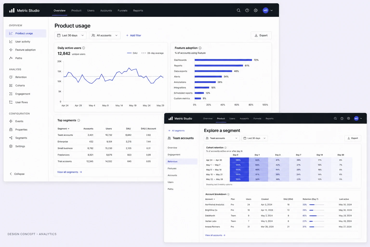
An operations dashboard concept exploring work-order triage, filters and contextual task details, with proposed status messages and interface rules.
Design concepts, not client projects. Screens are static mockups; names and data are illustrative.
The design brief
Help an operations coordinator move between the workload overview and an individual work order. The design gives exceptions a visible place without turning every row into an alert.
- Designed for
- Coordinators and team leads reviewing work orders, assignment and outstanding tasks.
- Constraints to consider
- Priority, progress and ownership mean different things and should not share one ambiguous badge. Real deployment would also need role-based access and rules for simultaneous edits.
The proposed journey
- 01
Review the workload
The overview separates the workload chart from items needing attention, giving the coordinator two different ways into the queue.
- 02
Narrow the list
Filters sit above the work-order table. Each row keeps the task, location, assignee and status in predictable columns.
- 03
Inspect a work order
A detail panel groups the selected task’s checklist and activity, alongside the broader work-order context.
Reassignment with context
Why these design choices?
Do not make every signal compete
Attention items occupy a dedicated area. The table uses restrained badges so a priority flag does not look like a completion state.
Keep list and detail connected
The detail panel gives the coordinator room to inspect one task while retaining the surrounding queue. On smaller screens, this relationship needs a clear return path.
A closer look at the visual system
Proposed design specimens. These are static examples, not working controls or a production specification.
Colour roles
Workspace surface
#F3F6FA
Selection & actions
#075BCC
Navigation
#092239
Typography & spacing
Clear information. A considered next step.
Use a sans-serif family with distinguishable numbers and compact labels. Task titles carry more weight than identifiers; dates and secondary details stay quieter.
Use compact, consistent table rows for scanning, but give filters and row actions enough separation to avoid accidental selection. Detail sections need more breathing room than the queue.
Beyond the ideal state
Filtered empty state
No work orders match these filters. Clear a filter to see more tasks.
Assignment saved
Assignee updated. The work order remains open.
Edit conflict
This work order changed while you were editing. Review the latest version before saving.
Why separate work-order priority from progress?
Priority describes how urgently a task needs attention; progress describes what has happened to it. Showing them separately allows an urgent task to remain visibly urgent even when it is already in progress.