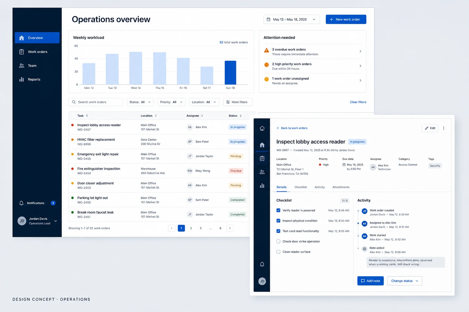
Admin & dashboards · Design concept
Analytics platform
An analytics workspace concept exploring product usage, cohort retention and account-level detail, with proposed data-state messages and chart design rules.
Design concepts, not client projects. Screens are static mockups; names and data are illustrative.
The design brief
Let a product team move from an overview to the detail behind a figure without losing the reporting context. The concept explores usage and retention with entirely illustrative data.
- Designed for
- Product and operations teams investigating usage patterns and comparing groups of accounts.
- Constraints to consider
- A figure needs a defined period, population and calculation to be interpretable. The mockup does not establish real metric definitions, data freshness or analytical findings.
The proposed journey
- 01
Read the overview
The main workspace combines usage trends and adoption summaries with a visible reporting period.
- 02
Inspect retention
The detail view introduces cohort retention so an overview question can be examined at a more specific level.
- 03
Check account detail
An account breakdown supplies tabular detail alongside the charts for closer inspection of the illustrative records.
Compare on the same basis
Why these design choices?
Keep reporting context attached
Date and segment controls belong near the report they affect. A detailed view should carry the active context forward rather than quietly changing its scope.
Give charts and tables different jobs
Charts show the shape of a comparison; rows expose individual values. Colour is reserved for meaningful distinctions, with labels needed to explain them.
A closer look at the visual system
Proposed design specimens. These are static examples, not working controls or a production specification.
Colour roles
Report canvas
#F5F6FA
Selected data series
#5149C9
Navigation & labels
#202438
Typography & spacing
Clear information. A considered next step.
Use a sans-serif family with aligned numerals for figures and tables. Metric labels should remain visible beside values; small footnotes must not carry essential definitions alone.
Separate report groups with clear margins, then align titles and chart areas within each group. Keep filters together so their shared scope is apparent.
Beyond the ideal state
No data for selection
No records match this period and segment. Adjust the filters to continue.
Report refreshed
Report refreshed for the selected period. Review the data timestamp before sharing.
Refresh failed
The report could not refresh. Previously loaded data is still shown; try again.
Why retain date and segment context in an analytics detail view?
A comparison changes meaning when its time period or population changes. Carrying the active filters into the detail view makes the scope explicit. Metric definitions and data quality still determine whether any conclusion is justified.