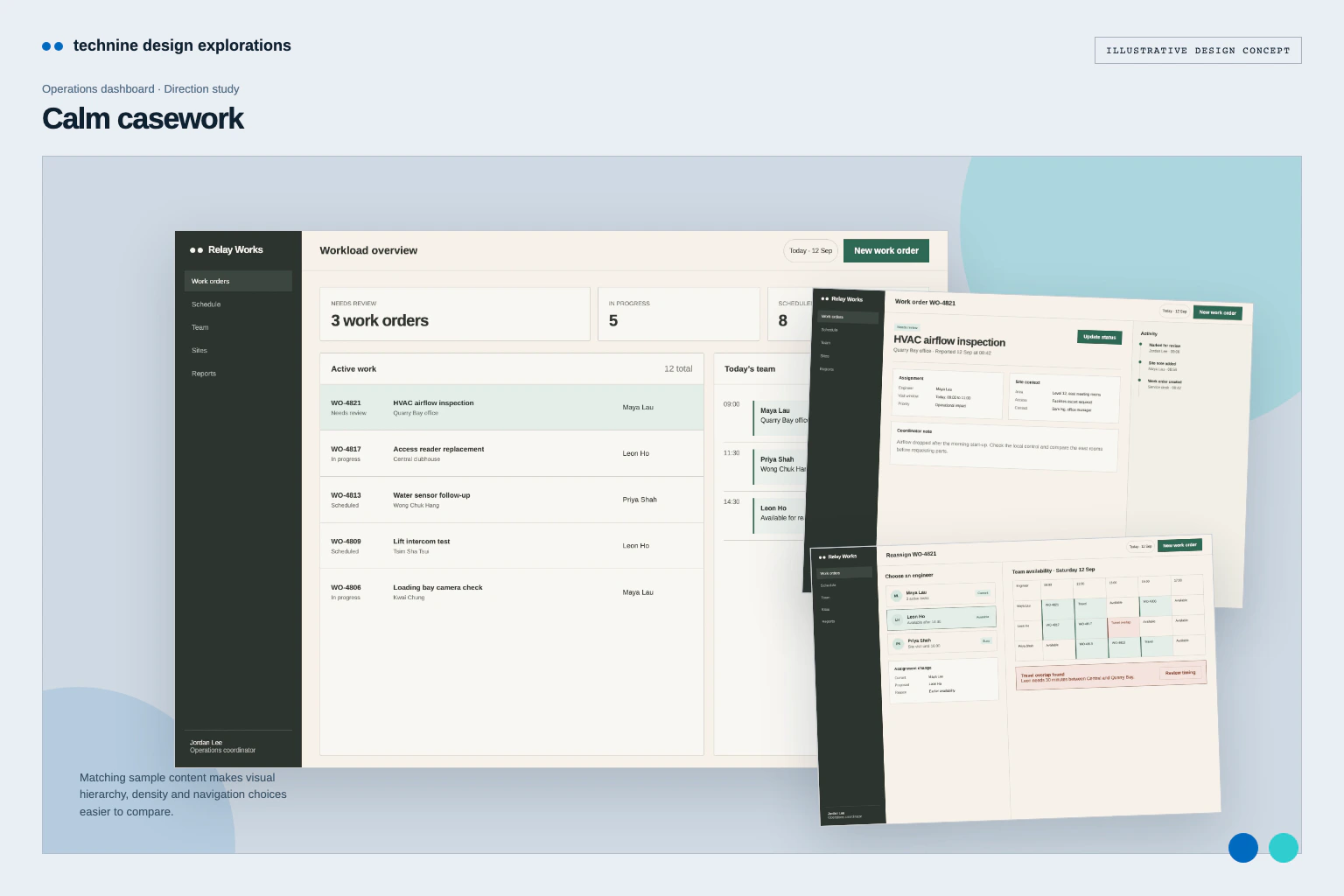
Admin & dashboards · Design concept
Dispatch workspace — Operations dashboard design
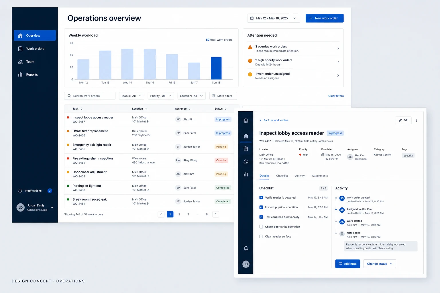
An operations dashboard concept for a dense work queue, team availability and reassignment, using deep navy surfaces and cobalt selection states.
Design concepts, not client projects. Screens are static mockups; names and data are illustrative.
The design brief
A dense coordination direction with a command bar, availability timeline and live queue.
- Designed for
- Coordinators and team leads reviewing work orders, assignment and outstanding tasks.
- Constraints to consider
- The dense queue and availability timeline must support fast scanning without suggesting live dispatch data. The selected rows, travel blocks and conflict message are illustrative.
The proposed journey
- 01
Dispatch overview
A team-availability timeline sits above the compact live work queue.
- 02
Selected work order
Task details and recent activity stay together in one operational view.
- 03
Reassign work
Availability and the assignment choice sit together before a coordinator saves.
Why these design choices?
Design decision 1
The availability timeline exposes open time and travel blocks before a coordinator changes an assignment.
Design decision 2
Cobalt marks active operational context; the conflict message protects another coordinator’s update instead of overwriting it.
A closer look at the visual system
Proposed design specimens. These are static examples, not working controls or a production specification.
Colour roles
Dispatch field
#101D2C
Queue surface
#101B28
Active selection
#1666D8
Conflict message
#F0A43A
Typography & spacing
Clear information. A considered next step.
Use a compact sans-serif with tabular figures, firm column labels and visibly distinct task identifiers.
Place the horizontal command bar and availability timeline before the compact queue, with stable gaps around row actions and detail areas.
Beyond the ideal state
Filtered empty state
No work orders match these filters. Clear a filter to see more tasks.
Assignment saved
Assignee updated. The work order remains open.
Edit conflict
This work order changed while you were editing. Review the latest version before saving.
Why place availability above the work queue?
A coordinator can check open time before changing an assignment. The dense layout keeps more work visible, but requires stronger selection states and clear task labels than the calmer review design.