Websites · Design concept
Event discovery website
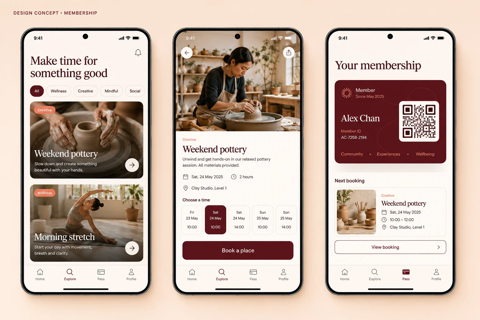
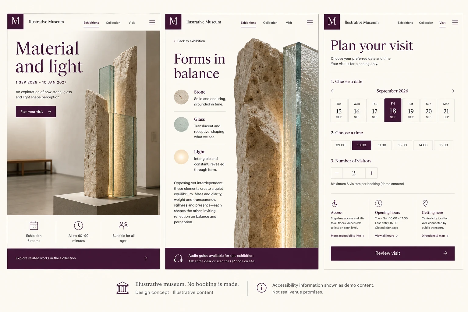
An expressive event website concept connecting listings, event details and ticket review, with proposed availability and selection states.
Design concepts, not client projects. Screens are static mockups; names and data are illustrative.
The design brief
Give events a distinctive visual identity while keeping the practical decision clear: what is happening, when, and which ticket is being selected.
- Designed for
- Visitors comparing events and checking their intended ticket selection.
- Constraints to consider
- Expressive graphics must leave dates and venue information readable. Events and ticket data are fictional; the concept does not reserve tickets or process a purchase.
The proposed journey
- 01
Browse events
The listing introduces events through a bold visual layout.
- 02
Check the details
The event detail gives a selected programme its own space before ticket selection.
- 03
Review tickets
A review screen presents the proposed ticket choice. It is not a purchase receipt.
Why these design choices?
Give logistics a stable place
Dates and venue details should occupy predictable positions even when event imagery changes.
Separate intent from ownership
A selected ticket is not yet an issued ticket. Review and confirmation need distinct labels and service-backed behaviour.
A closer look at the visual system
Proposed design specimens. These are static examples, not working controls or a production specification.
Colour roles
Event accent
#F36A35
Titles & navigation
#222224
Programme canvas
#FFF4DF
Typography & spacing
Clear information. A considered next step.
Use bold sans-serif headings for event character, with quieter labels for dates and ticket types. Avoid using condensed display text for essential instructions.
Let event artwork breathe while keeping its date close. Use a more compact review layout so ticket information can be checked together.
Beyond the ideal state
No matching events
No events match these filters. Try another date or category.
Tickets selected
Your ticket selection is ready to review. No tickets have been purchased.
Ticket unavailable
This ticket type is no longer available. Choose another option.
How can an expressive event page keep ticket information clear?
Give logistical details a consistent hierarchy and reserve expressive typography for titles. Ticket choices need plain labels and a separate review stage. Whether visitors understand the distinction should be tested before adding a checkout.