Websites · Design concept
Restaurant reservations
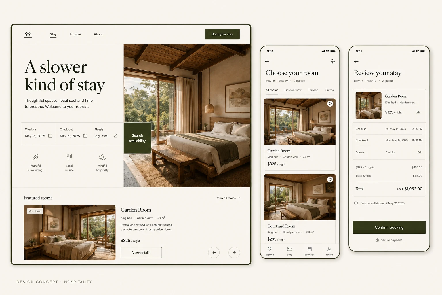
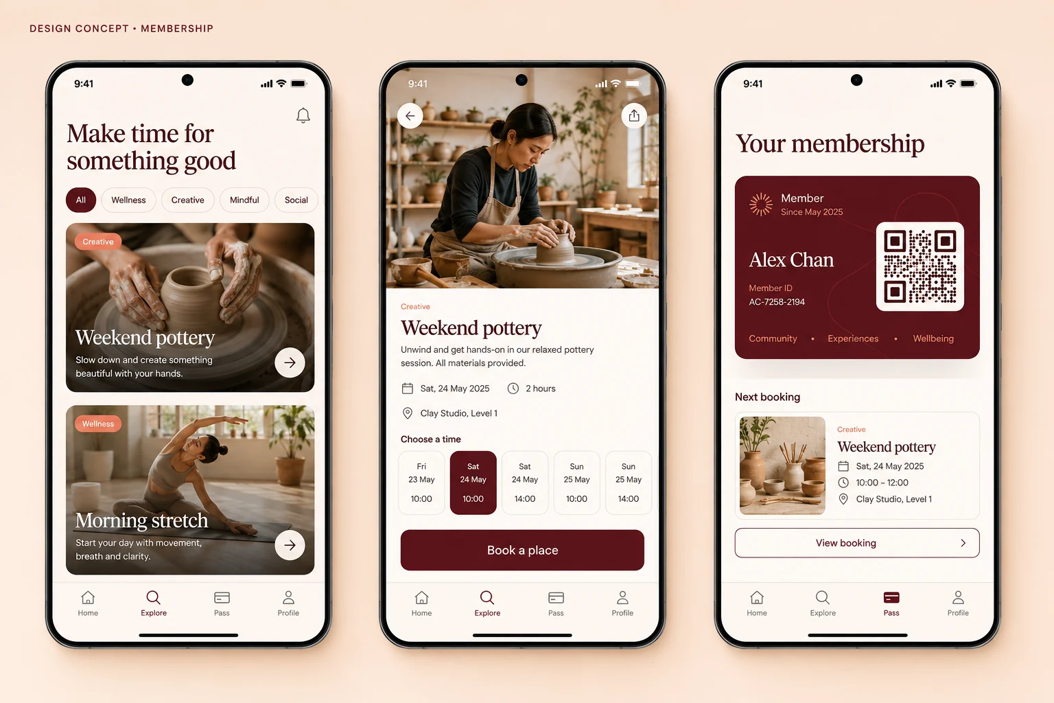
A restaurant design concept linking a desktop menu with mobile time selection and reservation review, alongside proposed availability and validation states.
Design concepts, not client projects. Screens are static mockups; names and data are illustrative.
The design brief
Bring the dining atmosphere and practical reservation choices into one journey. A dark, image-led website gives way to focused mobile screens for choosing and reviewing a time.
- Designed for
- Diners checking a restaurant’s menu and planning a visit on their phone.
- Constraints to consider
- Menu information must remain readable within the visual treatment. The concept stops at reservation review; it does not check live tables, confirm a booking or collect a deposit.
The proposed journey
- 01
Explore the menu
The desktop website introduces the dining direction and presents menu content within a dark editorial layout.
- 02
Choose a time
A mobile reservation screen focuses on selecting a visit time, separate from browsing the menu.
- 03
Review the request
The mobile review brings the proposed visit details together. This is a review stage, not a confirmed reservation.
Why these design choices?
Keep the menu legible
Cream surfaces and restrained accents balance the dark background. Dish information needs readable text, rather than being available only inside photographs.
Distinguish selection from confirmation
Choosing a time expresses a preference. A production flow must separately explain whether a table is held, a request is pending or a reservation is confirmed.
A closer look at the visual system
Proposed design specimens. These are static examples, not working controls or a production specification.
Colour roles
Dining backdrop
#142C26
Menu surface
#F4EAD8
Reservation accent
#B8774F
Typography & spacing
Clear information. A considered next step.
Serif headings suit the dining story. Use a clear sans-serif face for times, guest counts and form instructions, with numbers large enough to compare on a phone.
Give menu sections visible breaks. Group time options together but leave space between touch targets, then separate the review summary from its next action.
Beyond the ideal state
No available times
No times are available for this selection. Try another date or party size.
Time selected
Time selected. Review the details before requesting a table.
Selection changed
This time is no longer available. Choose another time before continuing.
Why separate reservation review from booking confirmation?
A selected time may still require an availability check or approval. The review screen lets diners inspect their choices without implying that a table has been secured. Confirmation wording should follow the actual reservation service response.