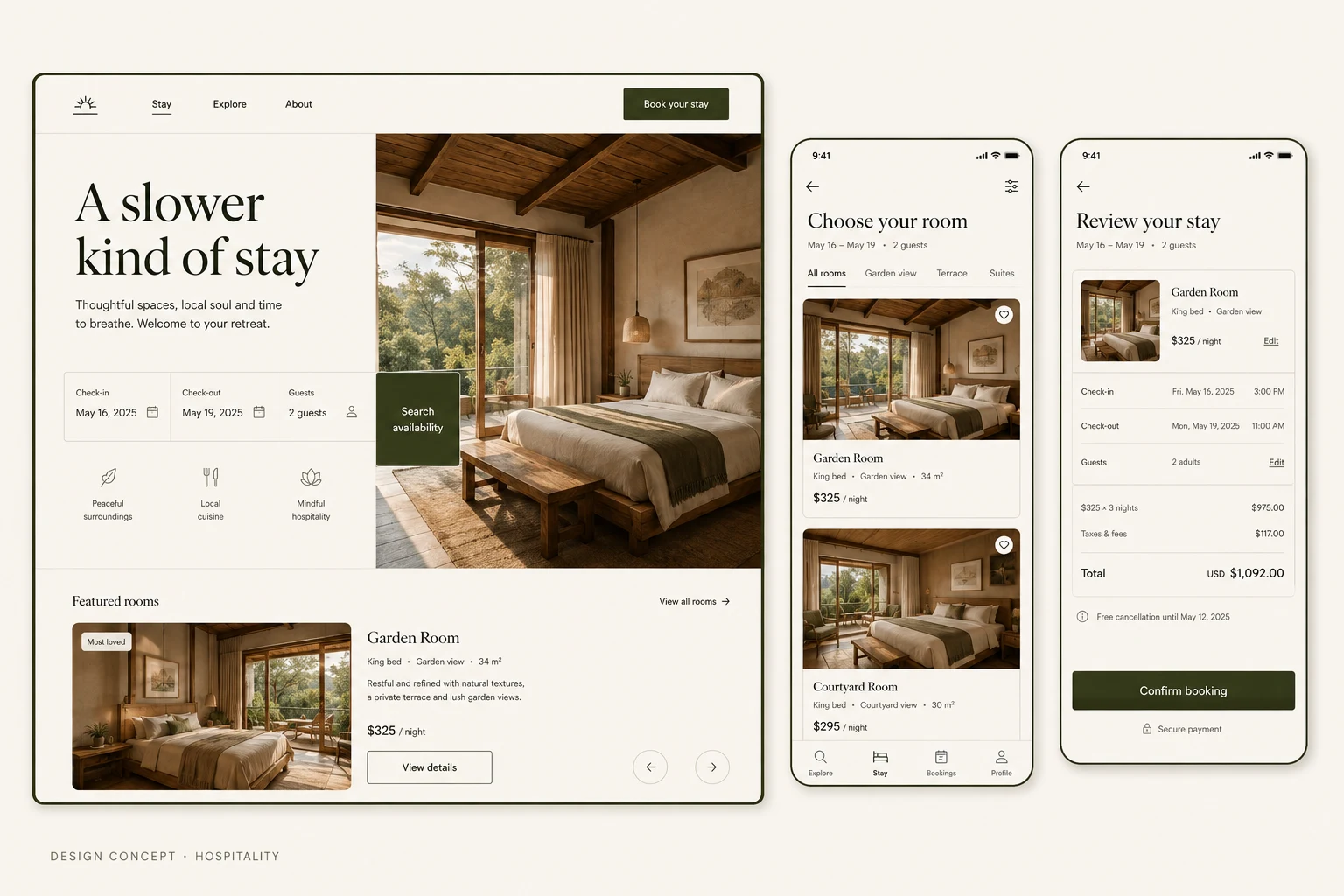
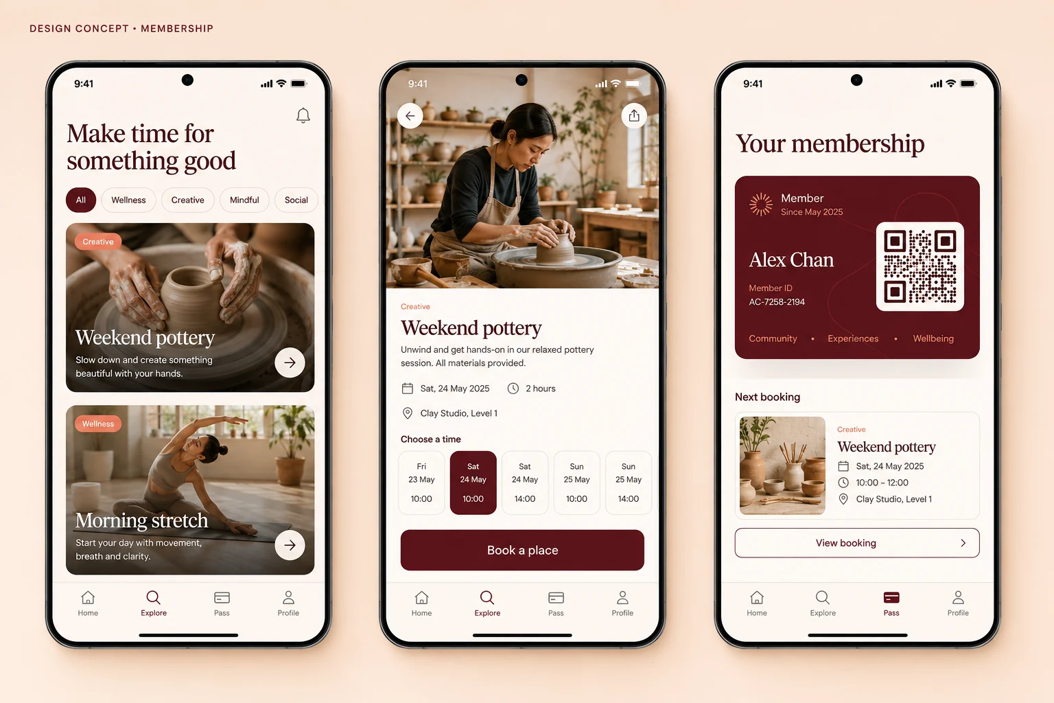
Websites · Design concept
Commerce website
A product-led commerce design study covering speaker discovery, product details and a shopping bag summary, with proposed selection and stock states.
Design concepts, not client projects. Screens are static mockups; names and data are illustrative.
The design brief
Let product photography carry the visual identity while giving shoppers a clear route from browsing to reviewing a selected item. The example is a fictional audio shop, not a functioning store.
- Designed for
- Shoppers comparing speakers and checking product options before proceeding with a purchase.
- Constraints to consider
- Product variants and availability must stay attached to the selected item. These screens stop at the shopping bag; checkout, delivery and payment are outside this concept.
The proposed journey
- 01
Browse the collection
A product grid places speaker photography above concise names and prices, with filters for narrowing the selection.
- 02
Inspect a product
The detail view gives the selected speaker a larger image and places its options near the add-to-bag action.
- 03
Review the bag
The bag summary shows the chosen product alongside the browsing experience so shoppers can check what they selected.
Review before checkout
Why these design choices?
Give products a consistent frame
Neutral backgrounds and repeated image proportions make the different products easier to compare visually. Brand expression comes from the products and the restrained red accent.
Show the consequence of a choice
The bag summary gives selection a visible destination. A production version should state the exact variant and quantity rather than relying on a thumbnail alone.
A closer look at the visual system
Proposed design specimens. These are static examples, not working controls or a production specification.
Colour roles
Product backdrop
#F6F5F2
Purchase actions
#C8442E
Text & structure
#242424
Typography & spacing
Clear information. A considered next step.
Use a clean sans-serif family. Product names lead, prices remain easy to scan, and supporting specifications should be readable without competing with either.
Keep product cards aligned and leave clear margins around the photographs. Group variant controls with the purchase action, while separating the bag summary from product description text.
Beyond the ideal state
Empty bag
Your bag is empty. Browse the collection to add a product.
Item added
Added to your bag. Check the selected finish and quantity before continuing.
Unavailable option
This finish is unavailable. Choose a different option.
Why show a bag summary before checkout?
The bag provides a checkpoint for the selected product and its options while the shopper is still browsing. It does not replace checkout, where delivery details, final charges and payment would need their own review.